Make-over
Usually, I have nothing against an updated lay-out. It happens all the time (‘cept here, I like to keep the same theme going, saves me HOURS and HOURS of work).
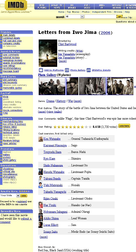
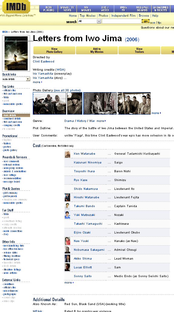
But now ol’ trusty IMDB decides to make a change too. And I don’t like it at all. Strange gaps all over the place, and everything is scattered (for instance, voting + grade is all the way at the right top).
What do you think ?
Old design:

New design:

Ah well, guess I’ll be a http://former.imdb.com/ user while it lasts (it will be removed in the near future).
February 20th, 2007 at 09:08
ugly indeed
February 23rd, 2007 at 17:08
Mag ik even zeggen dat ik het verschil niet eens zo groot vind?
Waar je je allemaal wel niet druk over kan maken…:roll:
June 19th, 2007 at 00:04
Finally, someone else who still uses the old layout. I hope that IMDb keeps the former.imdb.com site for years to come! The new design is horrid and definitely not an improvement over the user-friendly website design that has been up for years.